Mix Colors Like Cennino Cennini
Table of Contents
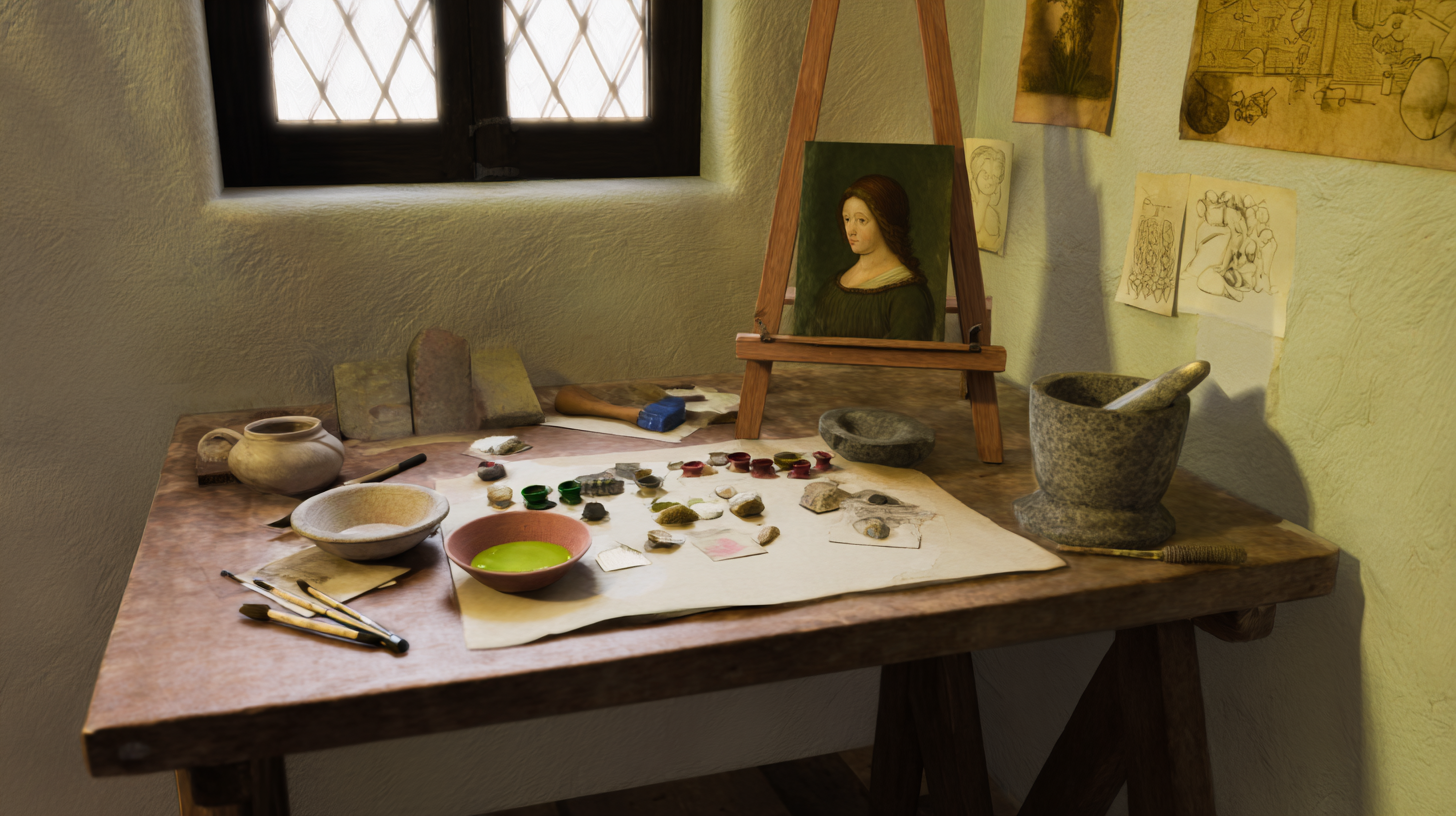
In this guide you’ll mix colors the way Cennino Cennini described—using egg tempera on a gessoed wood panel. We use only materials that were available in his time. Each recipe is written in plain language with “parts” (for example, 2 parts Yellow Ochre + 1 part Lead White), and we explain any terms as we go. At the end of the materials section you’ll find optional modern substitutes (like Titanium White for Lead White) so you can work safely with easily available paints.
What Defines Cennini's Color and Light
- Clear value separation with restrained chroma and earth-biased palette.
- Verdaccio influence in flesh (green-biased understructure yielding calm halftones). For a comprehensive modern approach to achieving these flesh tone principles, see our tutorial on mixing oil colors for realistic skin tones.
- Panel clarity: crisp drawing, controlled edges, matte-to-satin surface.
- Sky/blue garments from azurite/ultramarine; greens from green earth and mixes.
- Gold/neutral grounds kept low-chroma so focal reds and lights read strongly.
Historically Attested Materials → Optional Modern Equivalents
| Historical material | Role | Notes |
|---|---|---|
| Lead White | Lights, body in highlights | Period binder: egg yolk (tempera) or glair; keep lights structured |
| Lead-Tin Yellow (Type I/II) | Warm lights, gold notes | Strong tinting; sparing in lights |
| Yellow Ochre | Earth yellow | Controls midtones, especially flesh |
| Raw/ Burnt Sienna | Warm earth yellow/red-brown | Useful for halftones and warm veils |
| Red Ochre / Venetian Red | Opaque red earth | Drapery and flesh accents |
| Vermilion/Cinnabar | Warm accent red | Use sparingly due to high chroma |
| Azurite / Ultramarine (natural) | Deep/cool blue | Garments and shadows; expensive pigments used judiciously |
| Green Earth (Terre Verte) | Cool halftones | Verdaccio understructure for flesh |
| Verdigris | Transparent green glaze | For veils; stability considerations noted in period sources |
| Bone/Ivory Black | Deep shadows | Low chroma; semi-transparent |
Optional modern equivalents (for safety/practicality; not primary recipes):
| Modern substitute | Replaces | Pigment code(s) | Brand examples | Notes |
|---|---|---|---|---|
| Titanium/Zinc White | Lead White | PW6/PW4 | W&N, Gamblin | Cooler lights; adjust warmth with ochres |
| Bismuth Vanadate (Naples/Lead-Tin hue) | Lead-Tin Yellow | PY184 | MH, W&N | Strong tinting; use sparingly |
| Ultramarine Blue (modern) | Natural ultramarine/azurite | PB29 | Any | Transparent bias for shadows |
| Viridian | Verdigris | PG18 | W&N, Rembrandt | Safer green glaze |
Note on safety and access: If your local store doesn’t stock historical pigments or you avoid lead‑based paints, use the optional substitutes above. They won’t be a perfect 1:1 match, but they are safe, stable, and easy to buy.
Mediums, Grounds, and Surfaces
- Support: rigid wood panel, gesso ground (animal-glue gesso), optionally toned with thin earth wash (ochre/sienna).
- Binder (period-correct): egg yolk tempera (or glair) for body color; oil use is limited/contested for this period—if used, note as later retouch or specific passages.
- Surface sheen: matte to satin native to tempera; burnishing and thin oiling-out only if historically attested.
Value Design and Lighting Setup
- Simple, directional window light; keep background values in V2–V3 and low chroma.
- Reserve highest value/chroma for small accents (lights, reds).
- Use soft edges in halftones; crisp in drawing breaks and speculars.
Recipes — Swatches and Ratios (Period-Correct Tempera)
Mix these recipes by volume using a small spatula or palette knife. Value scale: V1 is darkest black, V5 is middle gray, V9 is pure white.
| Target color | Use case | Recipe (parts by volume) | Value | Notes |
|---|---|---|---|---|
| Verdaccio base | Flesh understructure | 2 parts Green Earth + 1 part Yellow Ochre + 0.5 parts Lead White + 0.25 parts Bone Black | V4–5 (mid-dark gray-green) | Keep cool and low-chroma; thin, lean mix with egg tempera |
| Flesh light | Forehead/cheek planes | 6 parts Lead White + 1 part Yellow Ochre + 0.5 parts Red Ochre | V8 (very light) | Veil warms with sienna; cool with azurite trace |
| Half-tone flesh | Transitional planes | 2 parts Yellow Ochre + 1 part Burnt Sienna + 1 part Lead White | V6 (mid-light) | Avoid chalky look; keep binder minimal. When studying historical paintings, you can extract precise flesh tone color palettes from your reference images to compare with these period-correct formulas |
| Subsurface warm | Ears/nose accents | 1 part Red Ochre + 1 part Yellow Ochre + 0.5 parts Lead White | V6–7 (light warm) | Glaze thinly over dry underlayers |
| Deep neutral shadow | Form shadows | 3 parts Bone Black + 1 part Burnt Sienna + 0.25 parts Ultramarine | V2 (very dark) | Low saturation; wipe back to unify edges |
| Blue mantle | Drapery cool | 3 parts Azurite + 1 part Lead White + tiny trace Red Ochre | V3–5 (dark to mid blue) | Red trace warms and naturalizes the blue |
| Gold note (painted) | Warm light accents | 2 parts Yellow Ochre + 1 part Lead-Tin Yellow + 0.5 parts Burnt Sienna | V7–8 (bright warm) | For painted gold highlights beside metal leaf |
| Background dark | Panel field | 2 parts Bone Black + 1 part Burnt Sienna + 0.5 parts Ultramarine | V1–2 (near-black) | Slight cool bias pushes depth and air |
Step-by-Step Workflow
Underlayer and Drawing
Apply a light imprimatura (thin wash of Yellow Ochre + Burnt Sienna mixed with egg tempera). Block-in accurate drawing and shadow shapes; keep the mixture lean.
Establish Shadow Family
Mix Bone Black + Burnt Sienna with a touch of Ultramarine (lean mixture). Place large, connected shadow masses; avoid overblending.
Midtones and Lights
Build from the verdaccio influence: start with Yellow Ochre mixtures, add Red Ochre for warmth, then step into Lead White for lights. Keep lights thicker and slightly warmer.
Edges and Accents
Sharpen selective edges around focal areas. Use Vermilion (or saturated Red Ochre) for tiny warm hits; reserve highest value highlights for last.
Unify with Glazes (Optional)
After the underlayers dry, apply very thin, controlled glazes (Ultramarine for cool depth, Burnt Sienna for warmth). With tempera, keep glazes very dilute.
Validate Mixes (Optional)
- Create labeled swatches under 5000K neutral light.
- Compare against target references; adjust ratios; note value/chroma shifts.
- If you measure color, record ΔE and rationale; otherwise, describe the visual match.
Troubleshooting and Pitfalls
- Chalky lights: reduce Lead White, warm slightly with a trace of Lead-Tin Yellow or Red Ochre, consider a unifying glaze.
- Muddy halftones: separate cool/warm piles on your palette; avoid overmixing complementary colors. For foundational principles on preventing muddy mixes, see our tutorial on mastering color theory for oil painters.
- Dead shadows: add transparent warm colors (Burnt Sienna) sparingly; keep values very low and edges soft.
- Over-saturation: favor earth tones; use Vermilion only as tiny accents for maximum impact.
Get your color palette from your reference photo
Upload your reference image and get instant, accurate oil paint color recipes based on your palette.