Mixing Oil Colors for Realistic Skin Tones: Step-by-Step Tutorial
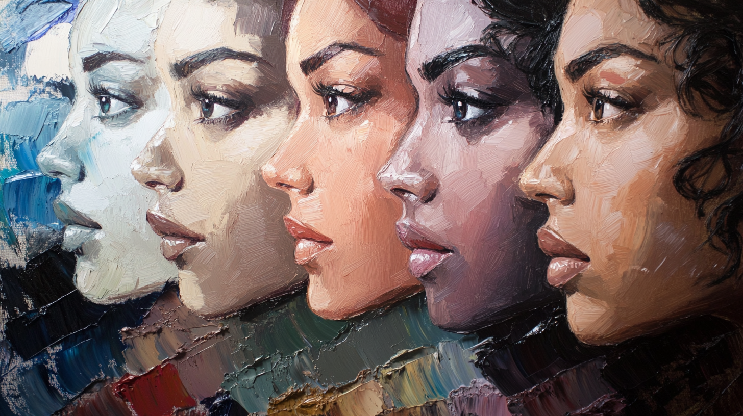
Capturing the luminosity and complexity of human skin is one of the most rewarding challenges in oil painting. Beginners often struggle with skin tones looking "chalky," "muddy," or like a flat orange mask. Realistic skin is translucent, reflecting the blood beneath and the light around it. This guide cuts through the confusion with professional mixing recipes, the famous "Zorn Palette" method, and advanced tips on facial color zones.
Need exact skin tone recipes from your photo?
Upload your portrait reference and get specific oil paint mixing ratios for every area of the face.
1. Introduction
Many artists overcomplicate skin tones by using too many colors. The truth is, skin is essentially a form of orange—muted, tinted, and shaded in endless variations. Whether painting pale, olive, or deep dark skin, the physics of light and pigment remain the same. The secret lies not in buying "flesh tint" tubes (which are often too pink and chalky), but in understanding how to balance warm and cool temperatures using a limited set of pigments.
2. The Best Oil Paint Palettes for Portraits
Option A: The Classic "Zorn Palette" (Highly Recommended for Beginners)
Anders Zorn, the Swedish master painter, created incredible portraits using just four colors. This limited palette forces harmony and prevents muddy colors because the gamut is naturally restricted to realistic skin ranges.
- Yellow Ochre: The primary yellow source.
- Cadmium Red Light (or Vermilion): The primary red source.
- Ivory Black: Acts as a cool blue when mixed with white.
- Titanium White: For value control.
Why it works: Ivory Black mixed with Titanium White creates a beautiful bluish-grey. When you mix this "blue" with the ochre and red, you get incredibly realistic olives, browns, and skin tones without ever touching a tube of blue paint.
Option B: The Full Color Portrait Palette
For more vibrant portraits or specific lighting effects, expand to this standard professional palette:
- Titanium White: The body of your light mixes.
- Yellow Ochre: Essential base for all skin.
- Cadmium Red Light: For warm, blood-rich areas.
- Alizarin Crimson (or Permanent Alizarin): For cool reds (lips, nostrils, cool cheeks).
- Transparent Red Oxide (or Burnt Sienna): For deep, warm shadows.
- Ultramarine Blue: For cooling down mixtures and creating deep darks.
- Viridian Green: Essential for neutralizing reds (creating "greys" and realistic shadows).
3. The Color Zones of the Face
One mark of a professional portrait is the subtle use of color temperature across the face. Classic academic painting divides the face into three general zones:
- Forehead (Yellow/Light): This area is often the most illuminated and has bone close to the surface, appearing slightly yellower or lighter. Mix: Add more Yellow Ochre and White.
- Middle Zone/Cheeks/Nose (Red/Warm): This area has many capillaries and blood vessels. The nose, cheeks, and ears are naturally redder. Mix: Introduce more Cadmium Red or Alizarin Crimson.
- Chin/Jawline (Blue/Cool/Green): On men (beard shadow) and often on women due to the angle of the jaw turning away from the light, this area appears cooler. Mix: Add a touch of Ultramarine/Ivory Black or Viridian to cool the tone.
Note: These are generalizations. Always observe your subject. A strong warm light might make the shadows cool violet, while a cool north light might make shadows warm brown.
4. Step-by-Step: Mixing a Master Skin Tone String
Don't mix one color at a time on the canvas. Instead, mix "strings" of value on your palette before you start. This ensures consistency.
Step 1: The Average Mid-Tone
Start by finding the average local color of the skin in the light (not the highlight, not the shadow).
Recipe: Yellow Ochre + Cadmium Red + White.
Adjustment: If it looks too orange (like a pumpkin), add a tiny dot of Blue (or Black/Viridian) to desaturate it towards a natural beige/brown.
Step 2: The Light String
Take a portion of your Mid-Tone and add White and a little Yellow Ochre.
Why Yellow? Adding only white makes red turn pink. Skin highlights are usually warm creamy yellow, not candy pink.
Step 3: The Shadow String
Take a portion of your Mid-Tone and add Transparent Red Oxide (Burnt Sienna) and a touch of Ultramarine Blue (or Viridian).
Crucial Rule: Do NOT use white in your deep shadows. White makes shadows look chalky and cloudy. Keep shadows transparent and dark using pigments, not black paint alone.
Step 4: The "Blood" Tone
Mix a pure, rich orange-red (Cad Red + Ochre). Use this pure color for the ears, nostrils, and fingertips where light scatters through the skin (subsurface scattering).
5. Managing Shadows and Highlights without Chalkiness
The "chalky" look is the enemy of realistic portraits. It happens when you add too much Titanium White to warm colors, cooling them down inadvertently.
- The Fix for Chalky Lights: If your highlights look pasty, add a tiny bit of Yellow Ochre or Cadmium Yellow back into the white mix. This restores the "sunlight" warmth.
- The Fix for Grey Shadows: If shadows look muddy, you likely used black or too much complementary color. Instead, use Transparent Red Oxide + Ultramarine Blue. This makes a deep, vibrant dark that glows.
- Turning the Form: The transition between light and shadow (the terminator line) is often more saturated (redder/orange) than the light or the shadow. Glazing a thin strip of Alizarin Crimson or Burnt Sienna along this edge brings the form to life.
6. Common Mistakes (And How to Fix Them)
Mistake 1: Using "Flesh Tint" Tubes
The Problem: Pre-mixed tubes are usually generic pink-beige. Real skin has greens, purples, and greys.
The Fix: Mix your own using the Zorn or Limited palette. It forces you to see the actual color temperatures.
Mistake 2: Over-Blending
The Problem: Smoothing every brushstroke makes the face look like plastic or wax.
The Fix: Lay down a stroke and leave it. Let the eye blend the colors. Use a larger brush than you think you need to prevent fiddling.
Mistake 3: Whites of the Eyes are White
The Problem: Painting the sclera (white of the eye) pure white makes the subject look startled or cartoonish.
The Fix: The eyeball is a sphere in shadow. The "white" is actually a dull grey-blue or warm cream, usually darker than the skin highlight on the nose. Only the tiny specular reflection highlight is pure white.
Final Expert Tip: When matching skin tones, always test the color on your palette knife and hold it up against the reference photo or model (if possible). It is easier to judge the color isolated on the knife than surrounded by other colors on the palette.