Mix Colors Like Jan van Eyck
The Inventor of Oil Painting?
Vasari credited Jan van Eyck with inventing oil painting. While he didn't invent it, he perfected the Flemish Technique—a method of layering so sophisticated it has never been surpassed. His paintings look like enamel or stained glass. They have zero brushstrokes and infinite depth. How did he do it? Transparency.
1. The "Dead Color" Layer (Grisaille)
Van Eyck started with a hyper-detailed drawing on a white chalk gesso panel. He then modeled the entire form in Grisaille (Grey) or Brunaille (Brown).
- The Physics: By establishing the values (light/dark) perfectly in monochrome, he didn't have to worry about value when adding color. The light reflects off the white gesso, passes through the layers, and illuminates the image from behind.
2. The Glazing System
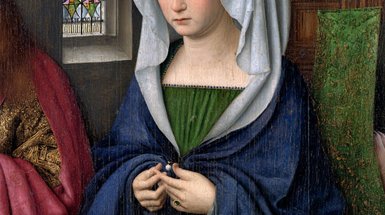
Van Eyck did not mix color on the palette like Impressionists. He mixed color Optically on the panel.
- To paint a green robe, he didn't mix blue and yellow.
- Layer 1: A solid underpainting of Lead-Tin Yellow (opaque).
- Layer 2: A glaze of Copper Resinate or Verdigris (transparent green).
- Layer 3: A deep glaze of Ultramarine (transparent blue) in the shadows.
This creates a "lens" effect. The yellow shines through the blue/green glass, creating a green that glows.
Turn any image into mixing recipes
Select a reference image, get oil paint color recipes from your palette.
3. The Medium: Oleo-Resinous?
There is a huge debate about Van Eyck's medium. It was not just linseed oil (which yellows and drips). It was likely a mixture of:
- Sun-Thickened Linseed Oil: Pre-polymerized oil that levels out brushstrokes (enamel effect).
- Pine Resin (Strasbourg Turpentine): Adds gloss, hardness, and transparency.
- Modern Substitute: You can mimic this today using Stand Oil mixed with a little Venice Turpentine or a modern alkyd medium like Liquin.
4. The Palette of 1430
To get the Van Eyck look, you need specific pigments (or their modern equivalents).
- Lead-Tin Yellow: The signature "Lemon" yellow of the Renaissance. (Modern: Nickel Titanate Yellow or Bismuth Yellow). It is opaque and covers well.
- Vermilion: A bright, orangey-red. (Modern: Cadmium Red Light).
- Lapis Lazuli: The ultimate blue. (Modern: High-quality Ultramarine).
- Madder Lake: A transparent cool red. (Modern: Alizarin Crimson or Rose Madder).
5. The "Microscopic" Detail
Van Eyck painted with single-hair brushes. He painted the reflection of a window in the eye of a horse. Technique: You cannot paint this detail wet-into-wet. You must paint a layer, let it dry, and then paint the detail on top. The Flemish technique is slow. It is a meditation.
- Patience is the Technique: Van Eyck likely spent months on a single panel, applying dozens of paper-thin glazes. Each glaze subtly shifts the color beneath. There is no shortcut. If you rush and apply thick glazes, you will get mud, not jewels.
Conclusion
To paint like Van Eyck is to build a house. You lay the foundation (Drawing), you build the walls (Grisaille), and then you decorate with stained glass windows (Glazing). It requires patience, but the result is a surface that looks like a jewel.