Mix Colors Like Cennino Cennini
The Craftsman's Handbook
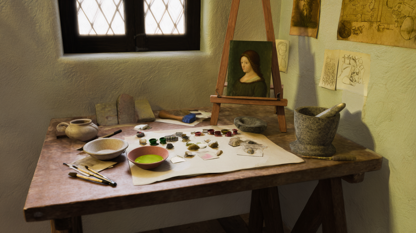
Cennino Cennini wrote Il Libro dell'Arte around 1400. It is the bridge between the Medieval and the Renaissance. While Cennini primarily taught Egg Tempera, his color theory is the foundation of all Western painting. His system is rigid, logical, and produces the luminous, spiritual "icon" look.
How do we adapt this to oil?
1. The "Verdaccio" (The Green Foundation)
This is Cennini's most famous contribution. He realized that human skin is translucent. If you paint pink directly on white canvas, it looks like a doll. The Physics: Skin has blood (Red) and veins (Blue/Green). Cennini taught painters to paint the entire face in Green Earth (Terre Verte) first. When you glaze thin pinks and ochres over this green base, the optical mixing creates a pearlescent, cool shadow that mimics the complexity of living tissue. The green neutralizes the red, preventing the "roasted meat" look.
Oil Recipe for Verdaccio:
- Terre Verte (or Chromium Oxide Green mixed with Ochre).
- Yellow Ochre.
- Titanium White.
- Mars Black (trace). Mix a greenish-grey monochrome. Paint the whole face. Let it dry.
- Strength Warning: Terre Verte is an extremely weak pigment. You will need to use a lot of it to get a visible green. If using modern Chromium Oxide Green as a substitute, use only a tiny amount—it's much stronger than the historical pigment.
2. The System of Three Values
Cennini did not blend wet-into-wet like we do today. He used a systematic approach. For every object (a red robe, a blue sky), he mixed Three Pots of paint:
- The Shadow (Dark): Pure pigment (e.g., Vermilion + Black).
- The Middle: Pigment + White.
- The Light: Pigment + More White.
Application: He painted them in bands, almost like a paint-by-number, and then used a fine brush to "hatch" (cross-hatch) the transition between the bands. In oil, we can blend these bands, but the discipline of pre-mixing your three values ensures your form is solid.
Turn any image into mixing recipes
Select a reference image, get oil paint color recipes from your palette.
3. The Pigments of 1400
To paint like Cennini, you must use earth pigments.
- Sinopia: A red earth (Red Ochre / Venetian Red).
- Ochre: The staple yellow.
- Vermilion: The precious, opaque red (Modern: Cadmium Red Light).
- Ultramarine: Made from Lapis Lazuli. More expensive than gold. (Modern: French Ultramarine).
- Bianco di San Giovanni (Lime White): (Modern: Lead White or Flake White Replacement).
4. The "Red on the Cheeks"
Cennini instructs: "Take a little Cinabrese (Red Earth) and touch it to the cheeks and lips to make them lively." After the Verdaccio and flesh tones are dry, you apply a delicate glaze of red to the focal points. Because it sits on top of the cool green underpainting, it vibrates.
Conclusion
Painting like Cennini means being a craftsman. It is about planning. You don't just mix on the canvas; you mix your "Three Values" in pots (or piles) beforehand. You rely on the optical physics of Green under Pink to create life. It is a structured, architectural way to build a painting.